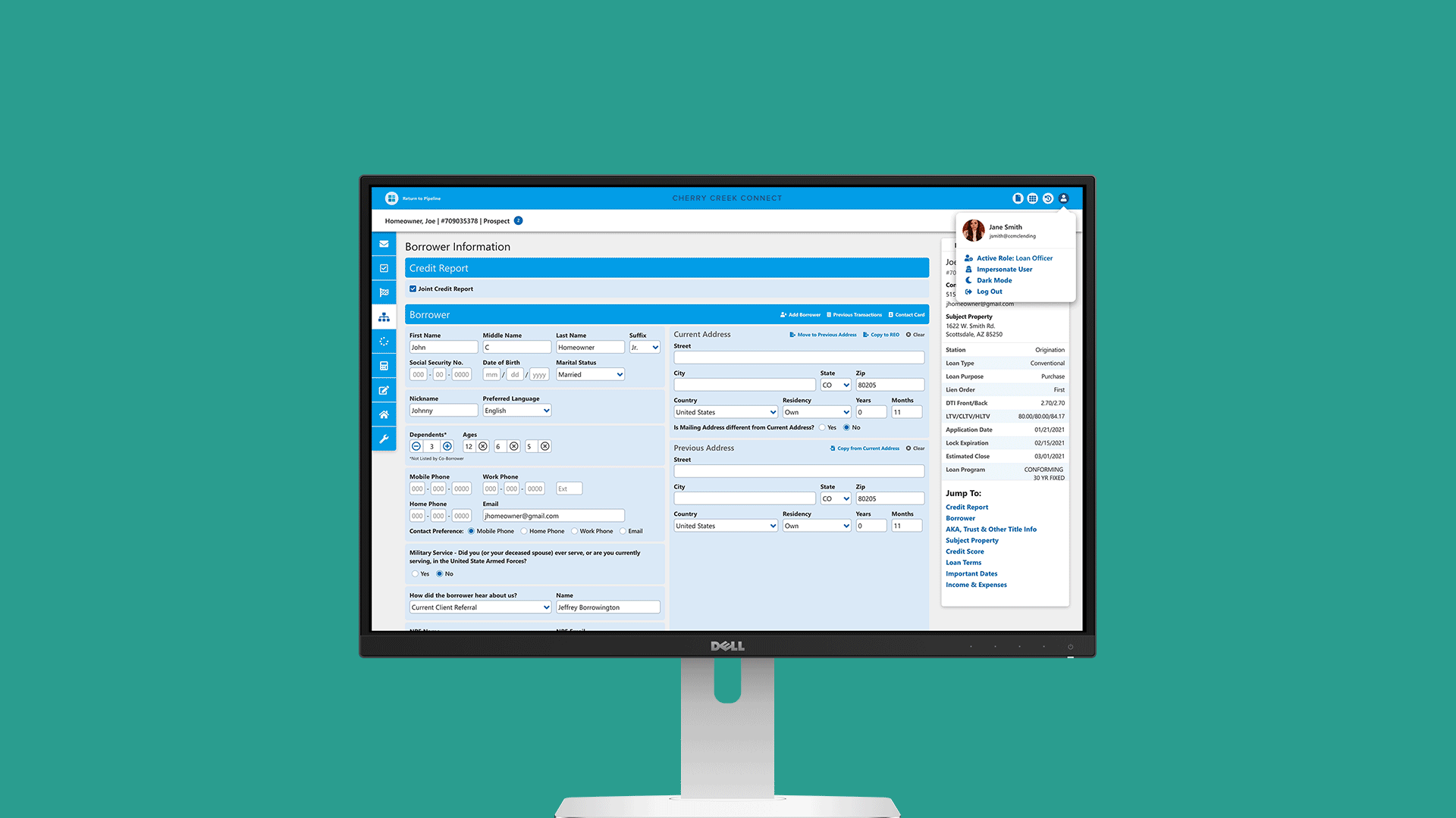


Directed efforts to give our loan management system various UX improvements from streamlined navigation to improved responsiveness to a fancy, new dark mode.
Above is a side-by-side of where we were (left) and where we’re going (right). Below is an example of the work I put in to help systematize our design elements to accommodate the addition of a dark mode.